Voyager [Design System]
Component Library
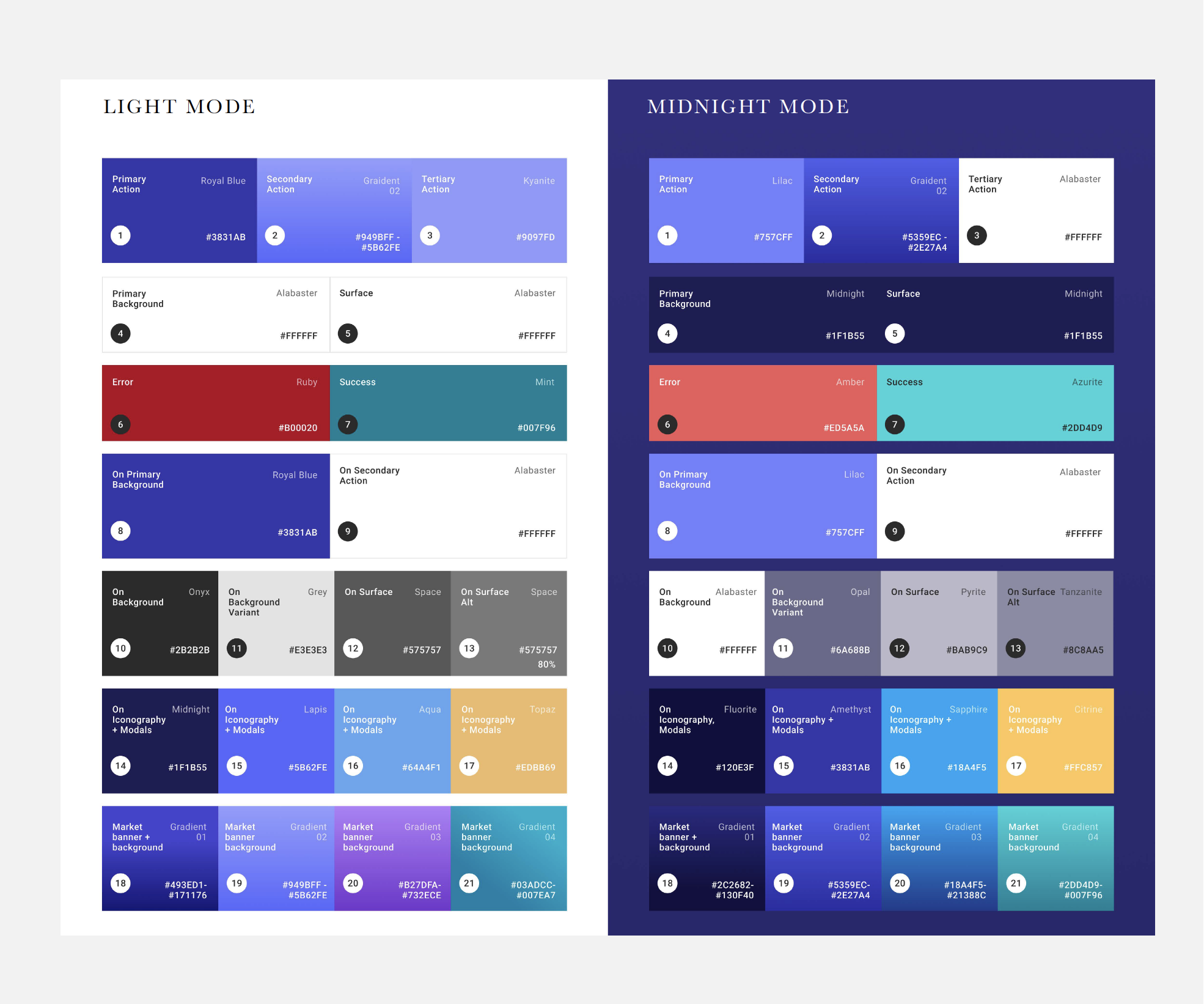
Before embarking on the dark mode project we took the opportunity to audit and clean up our design system and components from a color and typographic perspective. We reduced the number of styles and colors used across both iOS and Android to simplify future design sprints for both designers and developers.

Accessibility
This laid the groundwork for us to move into more detailed exploration of color. Our Light Mode was brought up to current accessibility standards and we evaluated and tested the various contrast ratios to find the best choices to improve our user’s experience of our mobile app. Using current Web Content Accessibility Guidelines (WCAG 2.0) we aimed for all colors to pass AA grades or higher in both dark and light modes to ensure optimum usability as well as color accessibility.

Dark Mode
When approaching dark mode, we chose to leverage our existing brand color palette. The foundation for all the dark mode screens is the midnight brand color that adds richness, depth, and warmth to the user experience rather than the expected choice of charcoal. We wanted people to feel immersed in a more mysterious version of Voyager, yet still feel welcomed – so we officially name it “Midnight Mode”.

